How to Use the Platform
Welcome to Explore ECHORN, where you can access data from the ECHORN cohort study focused on chronic disease in Caribbean populations. On this page, you will find some pointers for getting the most out of this resource.
WHAT can I DO WITH Explore ECHORN?
With Explore ECHORN, you have the freedom to create a variety of graphs and tables targeting the information you’re interested in. You can view information on a single variable or explore relationships between variables.
Here’s how:
First, you must choose a variable to make rows with; this step is necessary for creating any figure. Click and drag any variable of your choice from the dropdown menu on the left-hand side of the page. Expand any variable category that is of interest to choose a variable from that category.
Drag and drop your selected variable into the field labeled “Row.” In the below example, we’ve chosen “How often fresh fruits/vegetables available” from the expanded ”Nutrition” tab as our Row variable.

Upon completion of the previous step, your first chart will be automatically generated! This graph should display the number of participants shown on the y-axis (vertical line) stratified by the selected variable on the x-axis (horizontal line), as depicted below.


Examining Two Variables
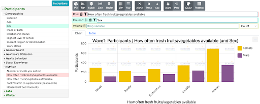
You can also examine the relationship between two variables. To do this, drag and drop another variable into the field labeled “Column.” This will generate a graph in which the data are sorted according to the column variable, indicated by color.
Continuing with the above example, we selected “Sex” for our column variable (note: the variable selected for columns will be highlighted green and the variable selected for rows will be highlighted red in the variable drop-down menu). Notice that, while the axes have not changed, the bars are now color-coded for the Column variable according to the key to the right of the chart.
You can switch the Row and Column variables by clicking on the arrows located in the Column row.
You can also show the data in a table rather than a chart by toggling between the “Chart” and “Table” tabs above the figure.


The Values Bar

By assigning a variable to the field labeled “Values,” you can view basic summary statistics of that variable, given the values of other variables assigned to Row and Column. Essentially, the Values field specifies what value will be shown on the y-axis (barring the amount of participants, which is the default y-axis when no variable is assigned to “Values”). The statistics you can view include: count, sum, average, standard deviation, variance, maximum, and minimum. You can view numerical data for the “Value” of interest (or the number of participants if there is no “Value” assigned) by hovering your mouse over any region of the graph. You can also change which of these statistics you view by clicking on the drop-down menu next to the Values bar, as indicated by the arrow below. The example below displays the average age of participants given their reported values for “How often fresh fruits/vegetables available” and “Sex.” Using this feature, you can make observations like: Female participants who sometimes had access to fresh fruits and vegetables were 55 years old, on average.

You can also view summary statistics for a variable given just one other variable, rather than two as shown above. Remember, you can’t make analyses on Explore ECHORN without having a variable assigned to “Row.” So, to do this, you will need to assign variables of interest to “Row” and “Values.” Keeping with our example, to view the average age of participants given how often they had fresh produce available, we would assign “How often fresh fruits/vegetables available” to the field labeled “Row” and “Age” to the field labeled “Values,” selecting Average as the statistic we’re interested in. Note that there is no variable assigned to “Column.”
Aesthetic Ribbon
There are also several options for tailoring the appearance of your chart or table using the ribbon of gray buttons at the top of the page.

Saving Your Chart/Table

Click or hover over the three-dot icon at the top right corner of the figure you’ve created (indicated by the arrow below). You can then choose the preferred mode of saving your figure as a whole (hover over “Image”) or the information within your figure (hover over “Data”) to your computer, or directly print.